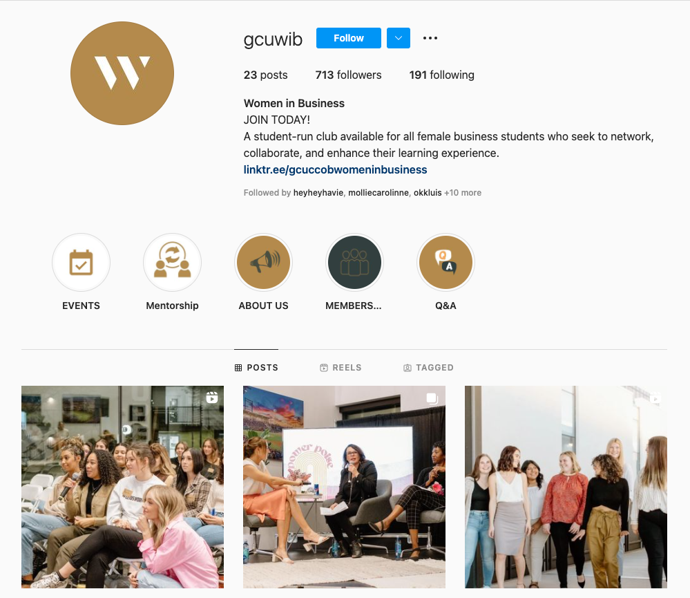
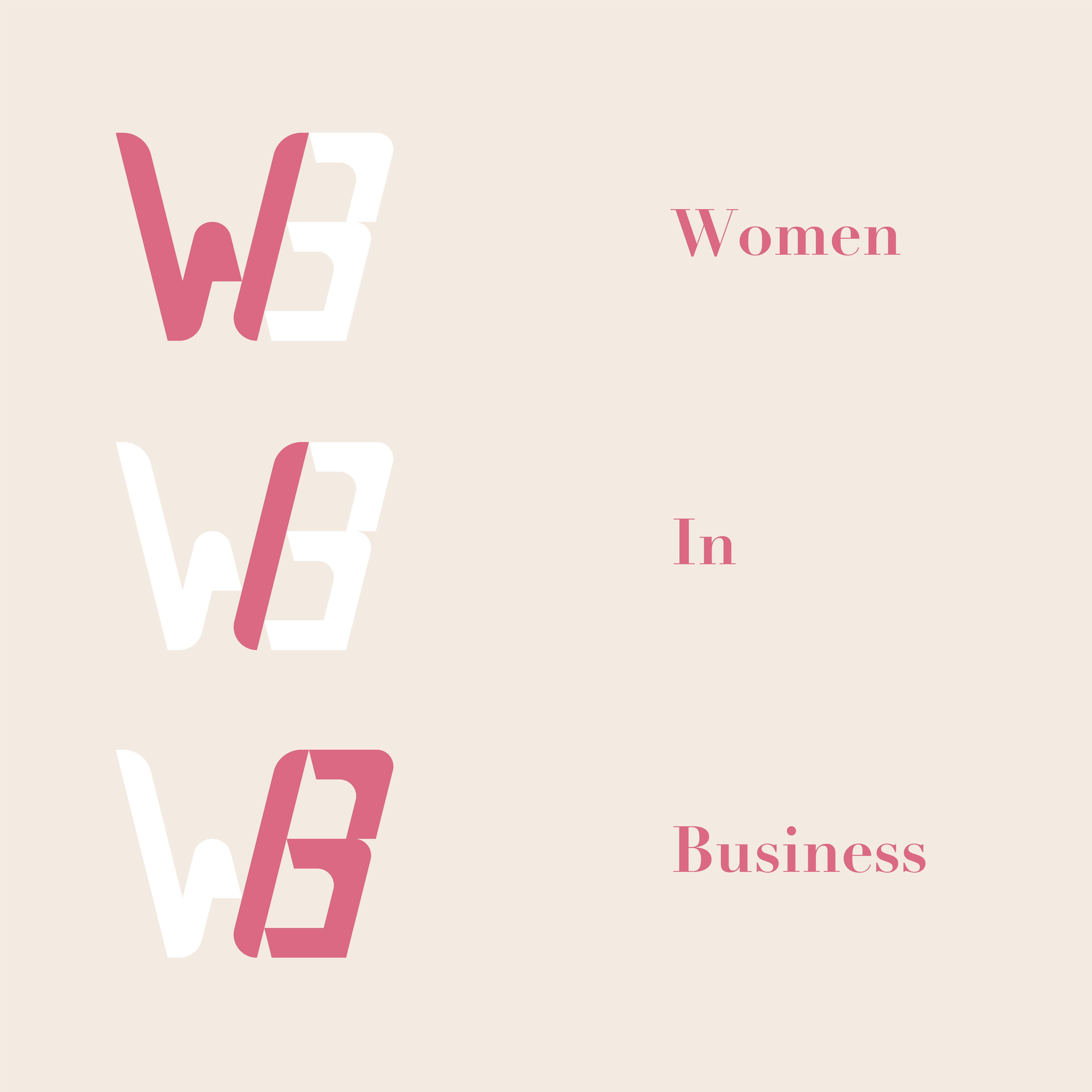
Women in Business Logo
This is the logo for my college first female business club. The task for this project was to try to capture professionalism and feminism in the same logo. I made the logo using triangles because they are the most stable shape as well as the traditional figure for the female torso. The sharp, pointed bottom elude to a stable, classy, and powerful woman.


The logo in a social media profile pictures shows that the logo is successful being reduced in size and still being recognized.
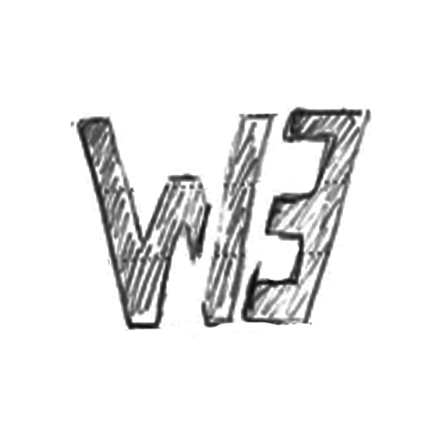
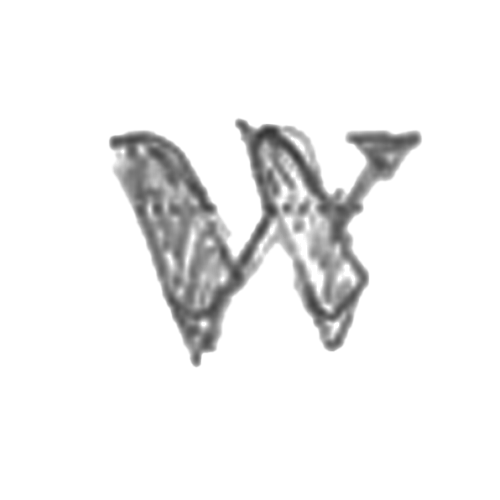
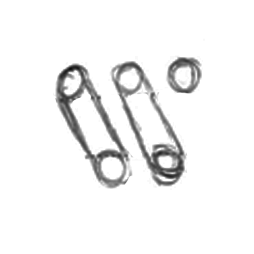
Roughs and Sketches
A possibility I explored was a logo with all three letters of the name. I chose not to go this route because the rounded corners does not give it the same feeling that the logo above does. Furthermore, it has very detailed corner that may be lost as the logo is reduced in size.

These are some of the sketches I made prior to vectorizing the final logo. As seen by the middle two logos, I decided to go for a more simple logo that still captured the needs and values of the client.