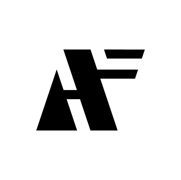
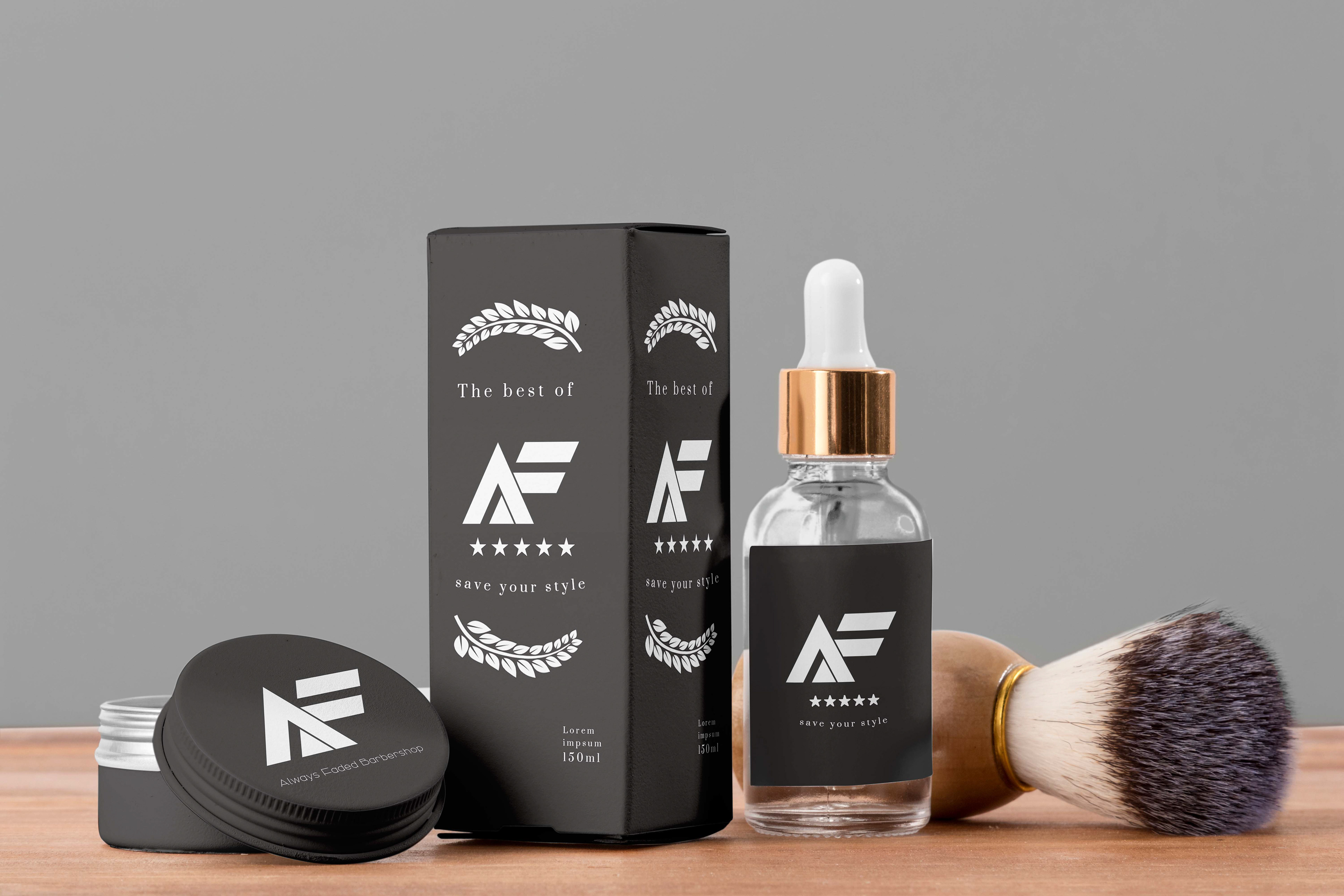
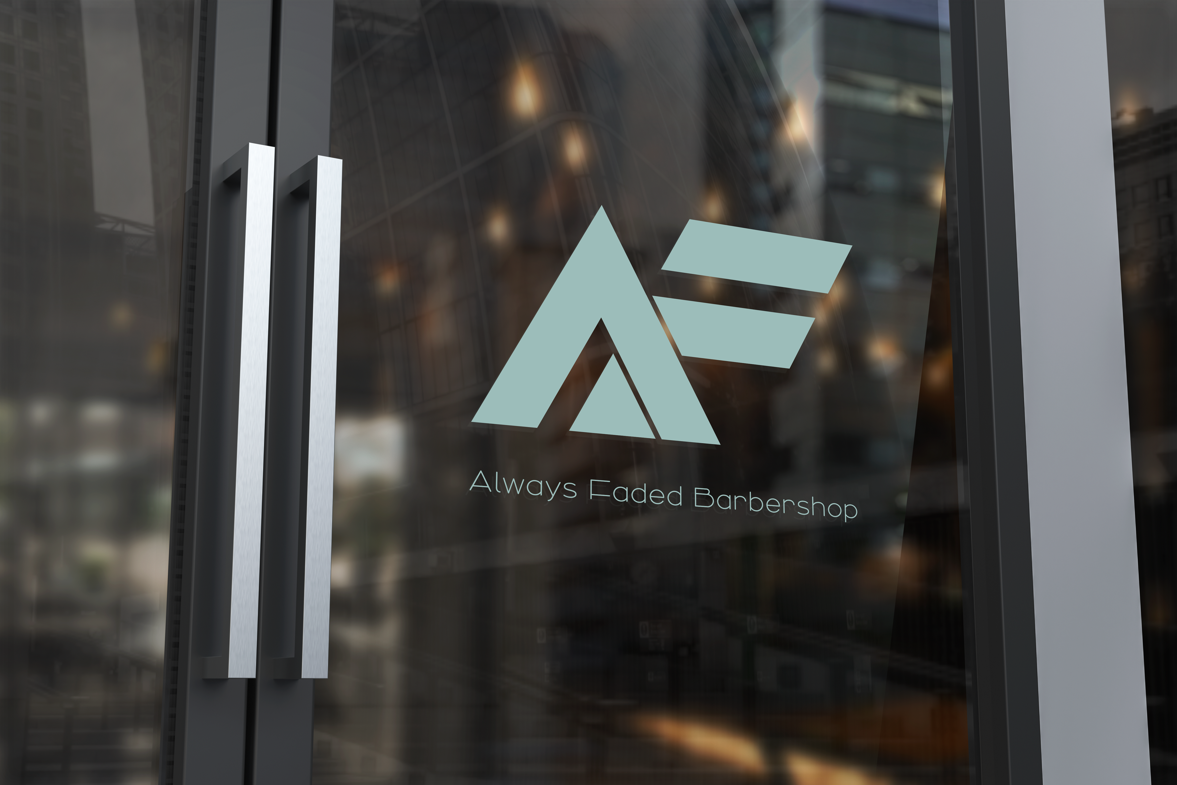
Always Faded Barbershop
Monogram for barbershop that offers cannabis products while giving excellent hair care. I strove to design a sharp logo to give a professional appearance two unrelated fields. The logo is successful at smaller scales because it is still recognizable.
Always Faded Barbershop wants to offer their customer the benefits of cannabis usage while avoiding the historical negative connotations. This logo is meant to gear the customer away from the negative thoughts of the cannabis industry by providing a clean, professional logo.
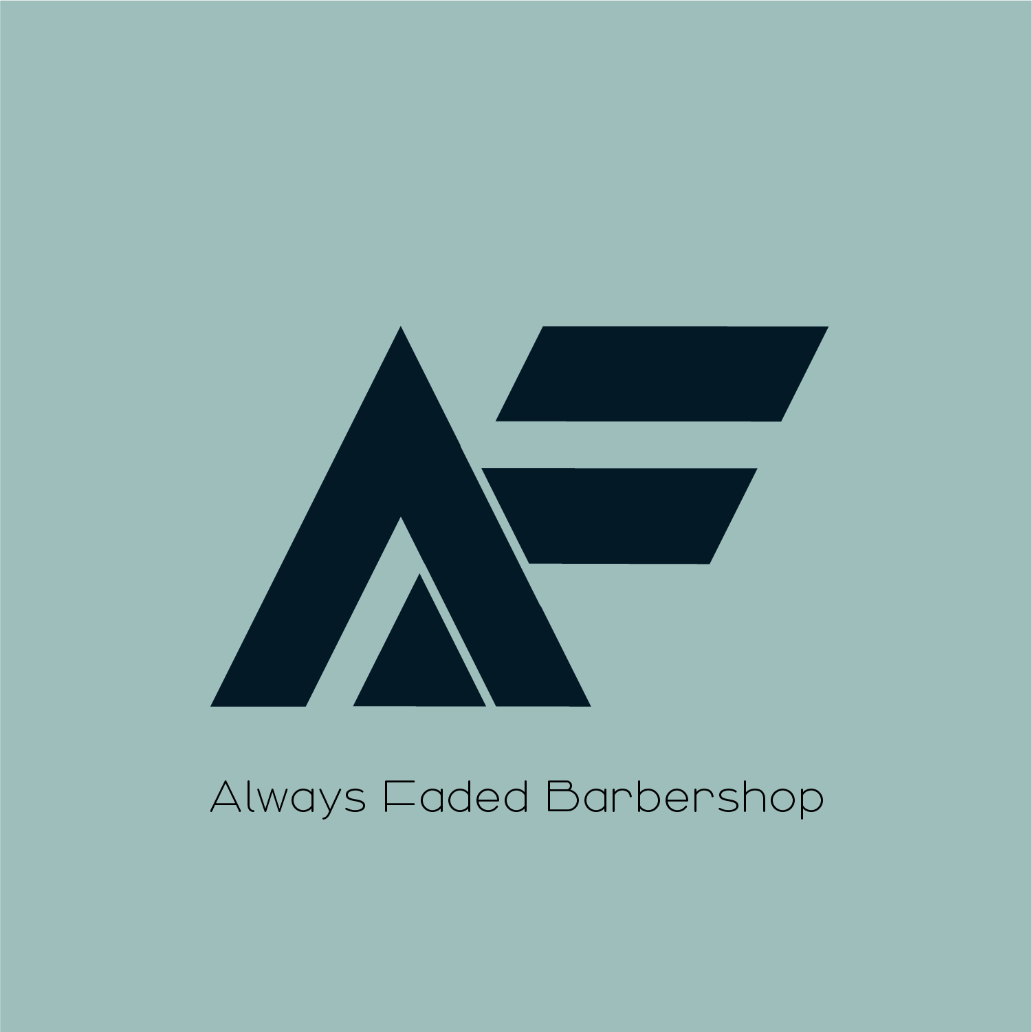
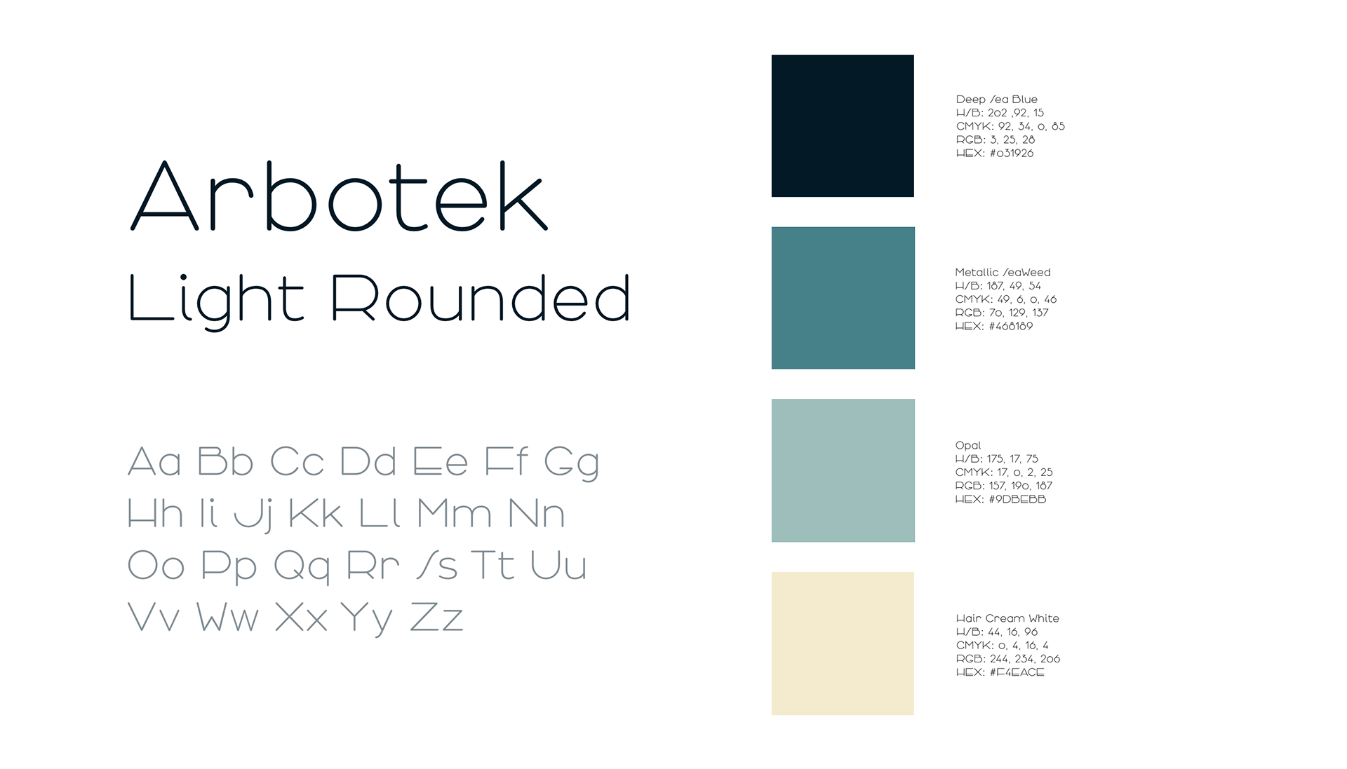
Font and Palette
The colors where chosen to pay homage to the cannabis industry while giving a twist of modern tones. They are sleek and work well with interior design so that their barbershop will have the same colors. The font was chosen because it is rounded so that it's kind enough to entice the customer in. A sharp font paired with the sharp logo would have been too bold.
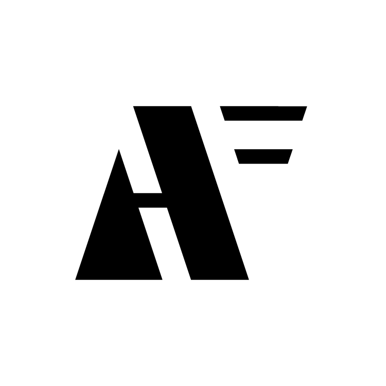
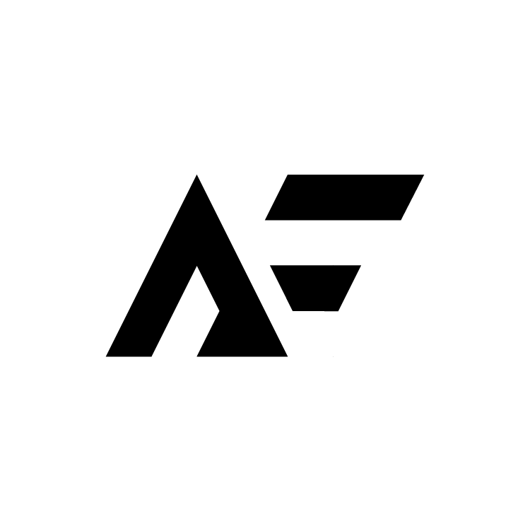
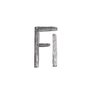
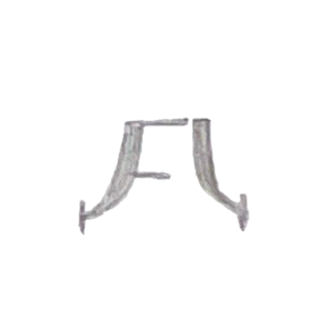
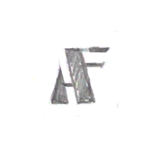
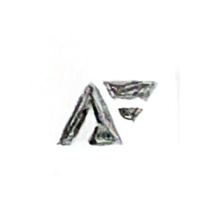
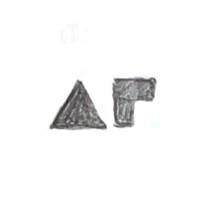
Monogram Roughs and Sketches
After thirty different explorations, I chose the following three because I wanted to give a sharp, bold feeling to the monogram. The first two were discarded because they were hard to read.